Salad
Dressings.
One category. Two tiers. Different jobs to do.
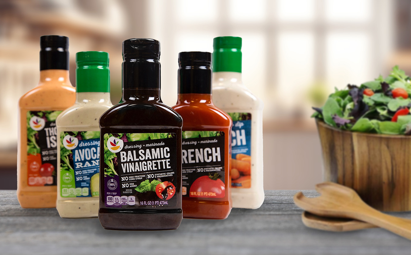
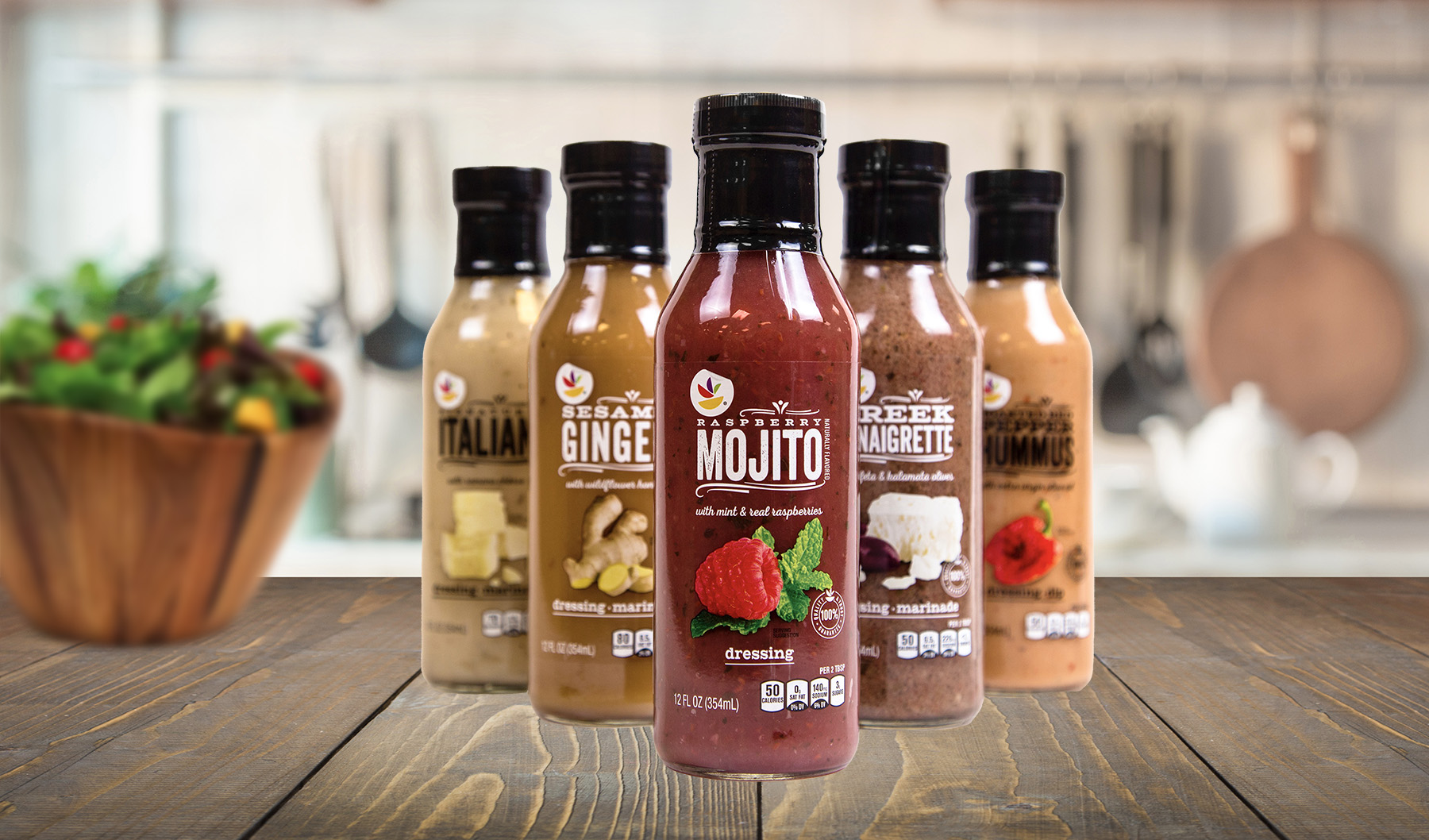
Make the difference easy to shop.
Core and premium dressings needed to live in the same category while communicating different value propositions immediately.
THE THINKING → Don't force one visual solution onto both tiers. Give each line the cues its shopper needs, then use disciplined hierarchy and photography to keep each system cohesive.
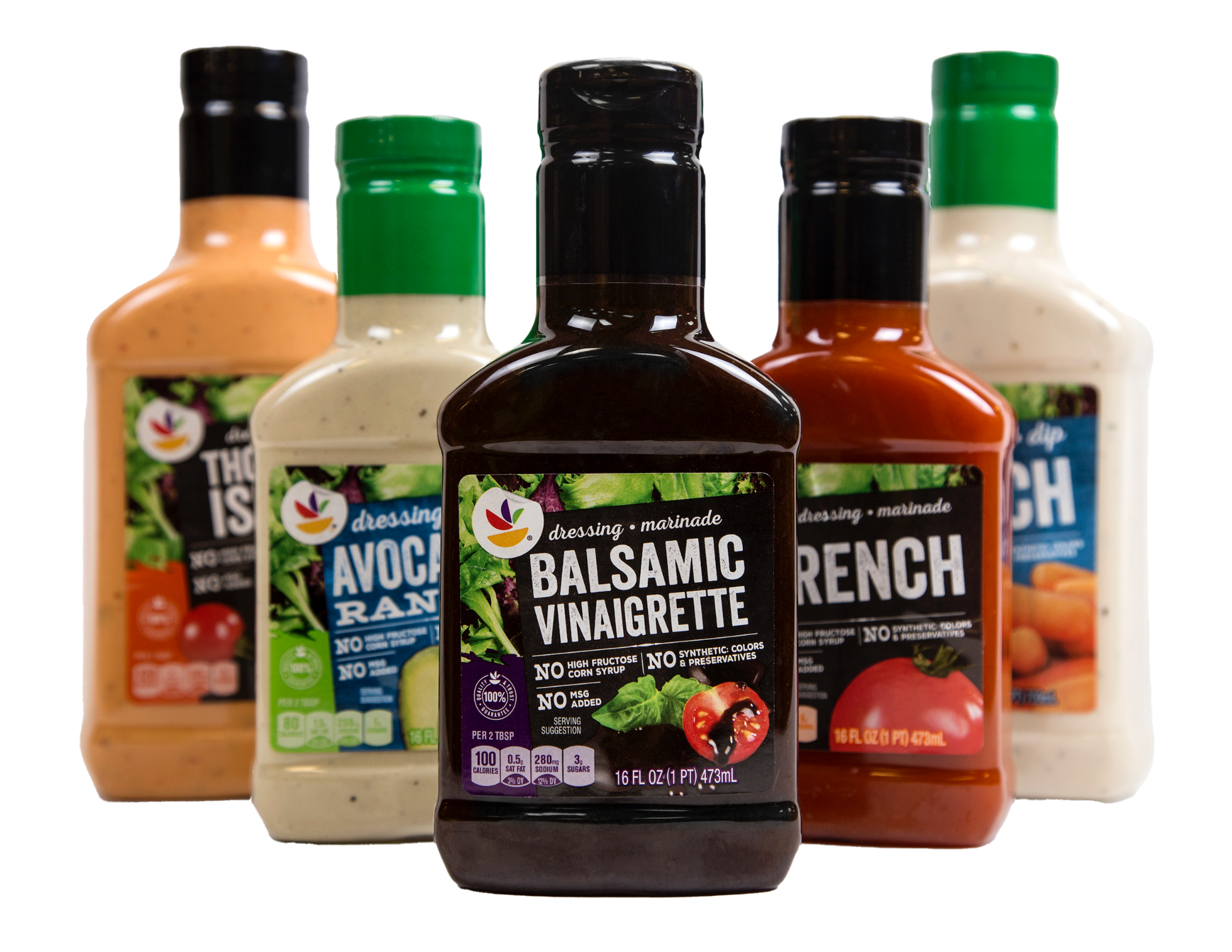
Fast, bold and easy to shop.
Large typography, a black slate field and straightforward flavor cues create immediate navigation. Leafy greens add freshness without complicating the read.
Show more of what you're paying for.
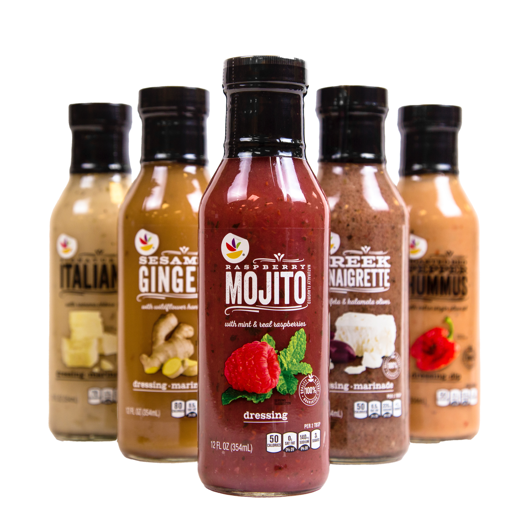
The premium line uses a clear label to reveal the dressing itself, paired with larger flavor photography and more expressive typography. The product becomes part of the design.

DESIGN THROUGH
PHOTOGRAPHY.
I designed both packaging systems and art directed the photography, shaping the visual cues that distinguish the tiers while keeping each line clear, appetizing and easy to shop.
two tiers. one clear strategy.