MORE WORK
Different problems.
Different audiences.
Same curiosity.
A few more projects that show the range behind the bigger case studies: illustration, beauty packaging and brand experiences built beyond the page.
01 / Illustration + Print
World
Peace.
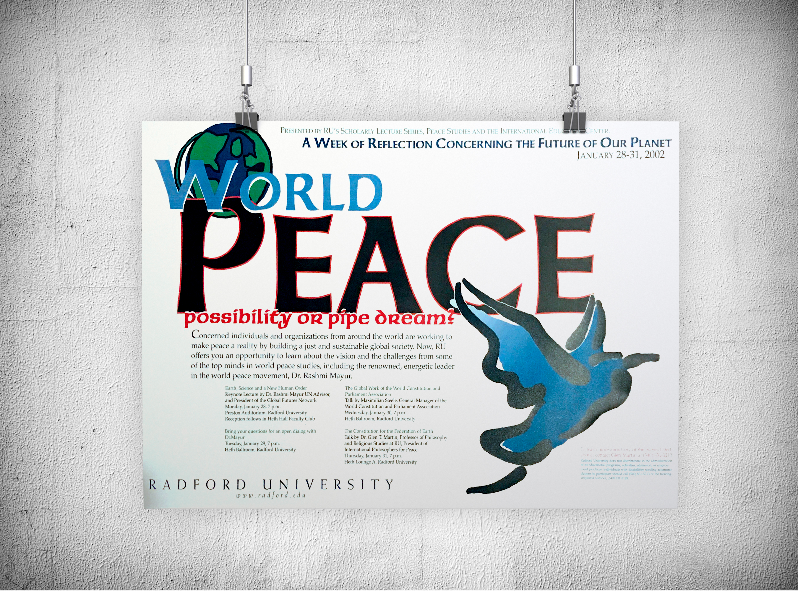
Created for a week-long peace event at Radford University, the poster needed to stop people long enough to make them curious. Illustration and typography do the heavy lifting, turning an information-heavy campus event into something with a point of view.
Illustration · Layout · Print Design
02 / Beauty + Body Care
Etos.
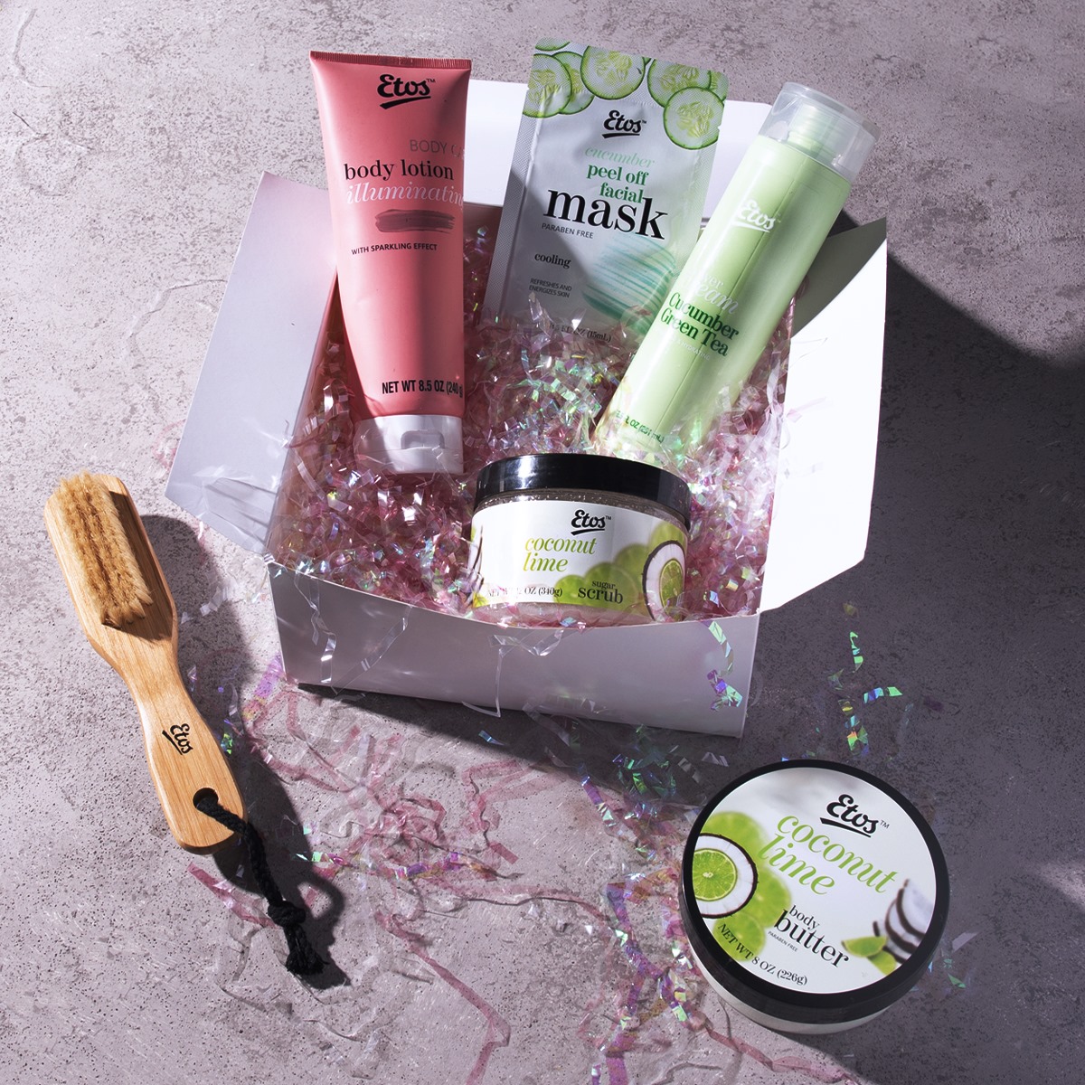
A playful body-care range where typography, color and ingredient cues get to do more than organize information. The mix feels energetic and beauty-forward without losing the clarity a family of products needs.
Packaging · Typography · Brand Expression
03 / Environmental + Brand Application
Ferguson,
beyond the campaign.
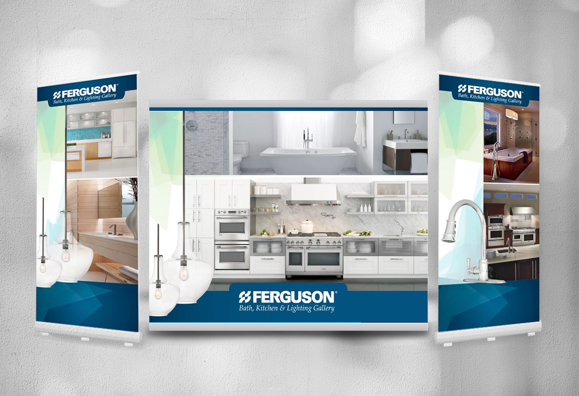
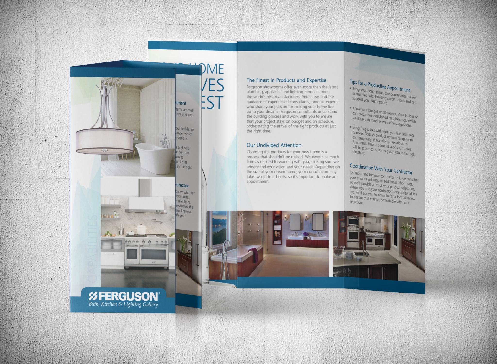
Ferguson work stretched across audiences and formats. From a trade-show environment to showroom collateral, the same visual language had to flex from a large physical footprint down to something a customer could hold in their hands.
Trade Show · Brochure Design · Environmental Graphics · Brand Application
04 / Editorial + Information Design
Quest.
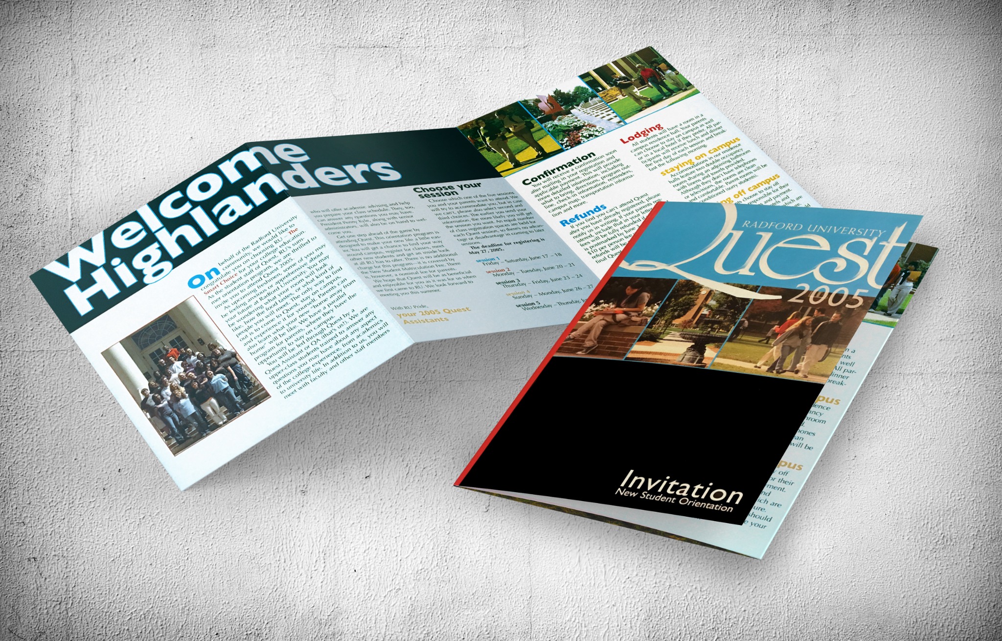
New student orientation comes with a lot of information and a lot of anticipation. This invitation for Radford University used bold typography, bright color and clear hierarchy to make the details easy to navigate while giving incoming students a first taste of campus energy.
Editorial Design · Typography · Information Hierarchy
05 / Packaging + Photography
Snack
nuts.
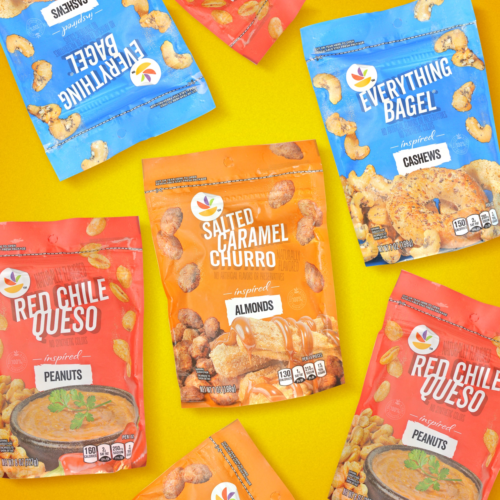
A flavor-forward snack line designed to bring energy to a crowded category. Bold color, oversized typography and appetite-driven imagery give each variety its own personality while keeping the family unmistakably connected.
Packaging · Art Direction · Photography Direction
THE THROUGH LINE
Make the idea clear.
Make the system work.
Make it worth looking at.
Different categories and different formats, but the same approach: understand the job, find the visual idea and build it well.