05 / PACKAGING + ART DIRECTION
Gelato.
Premium without being precious.
THE CHALLENGE
Let the product prove the point.
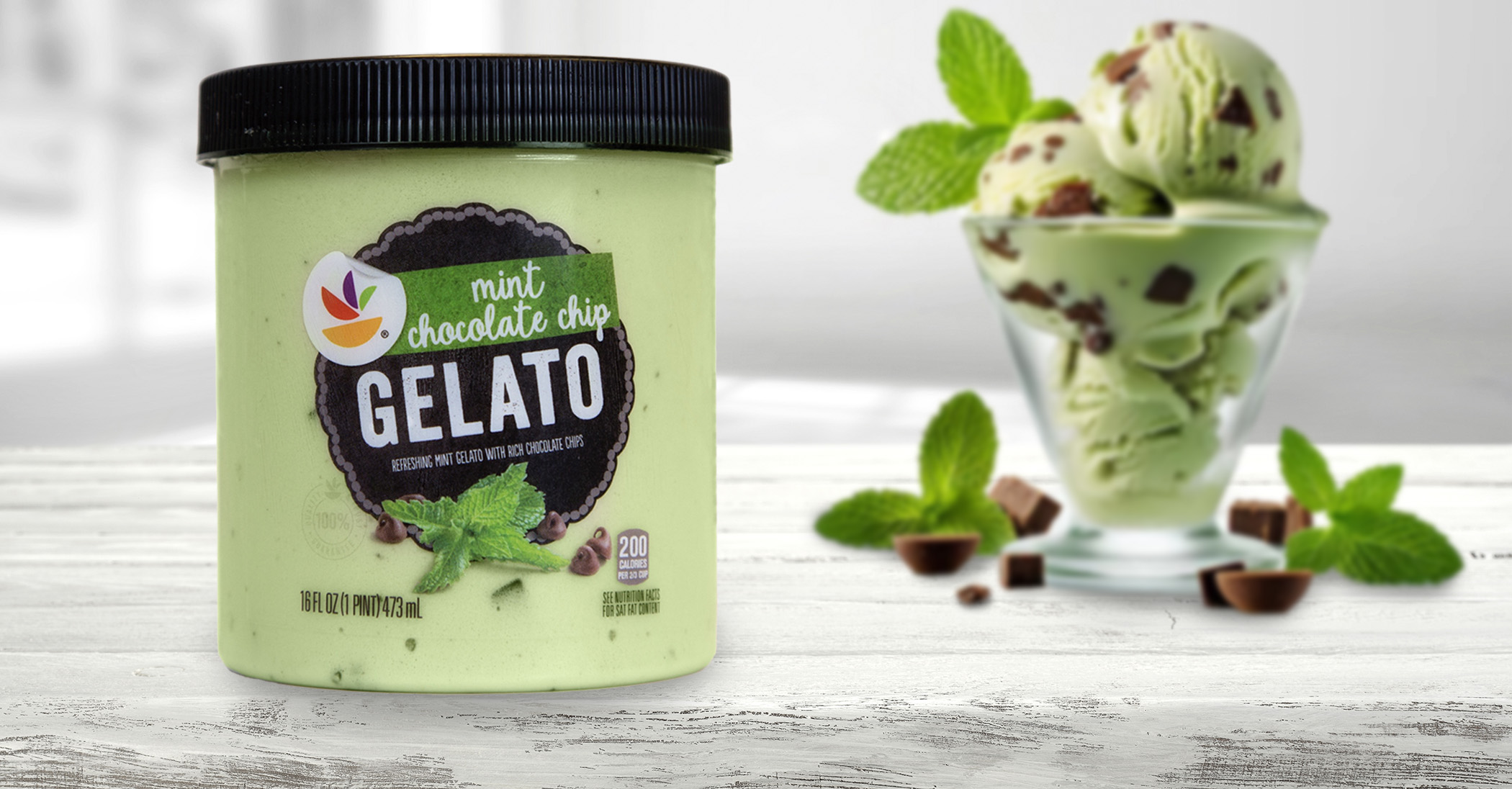
The product quality had stepped up, so the packaging needed to signal that change while still feeling accessible and easy to shop.
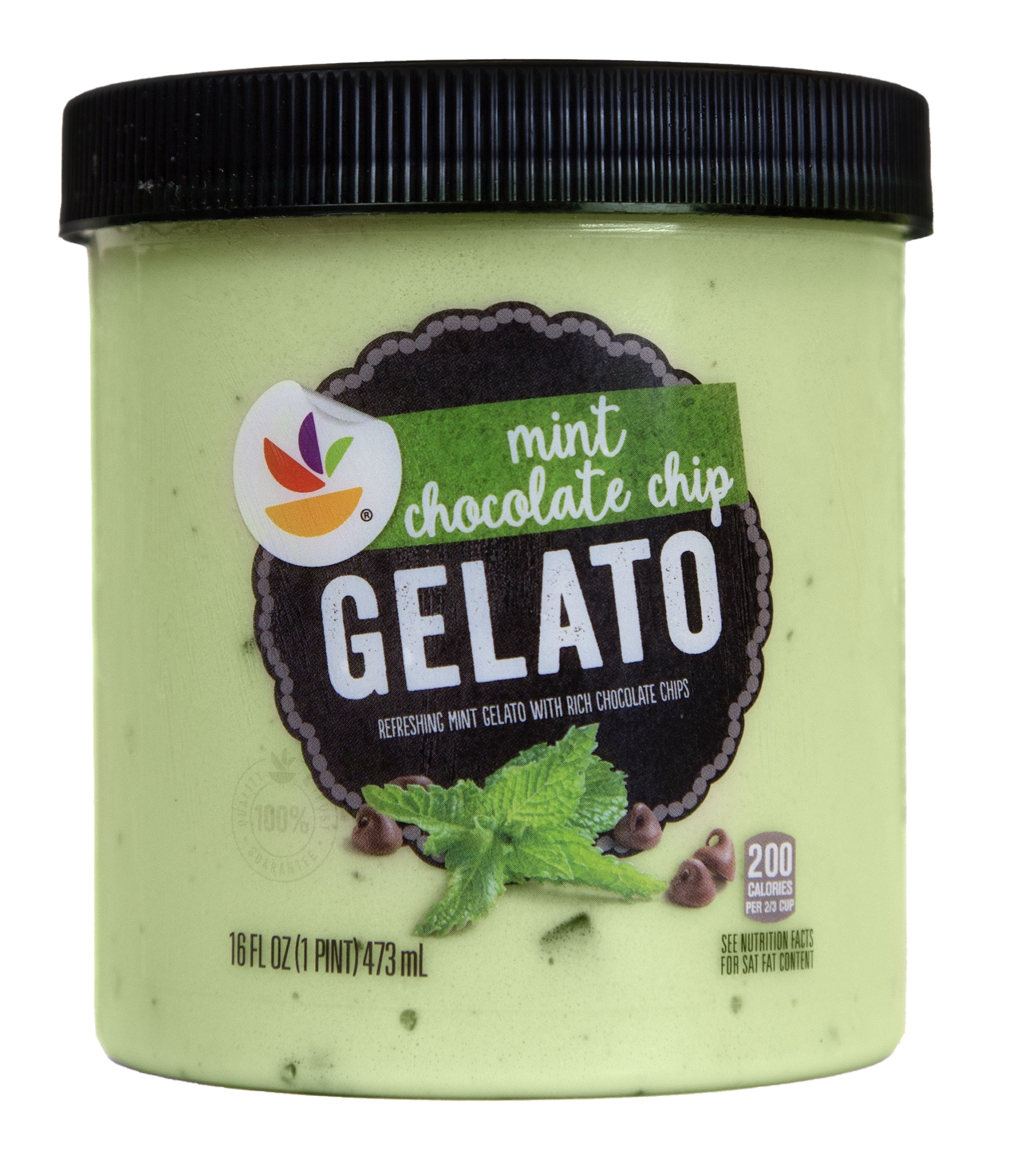
THE THINKING → Let the gelato show through. The clear-label construction makes the product part of the design, while the black holding shape, white typography and macro flavor photography communicate quality.
THE DESIGN
Simple. Delicate. Still impossible to miss.
A strong dark shape creates contrast against the gelato itself. Flavor photography does the appetite work, and the rest of the system stays restrained enough to let texture and product quality lead.
THE FAMILY
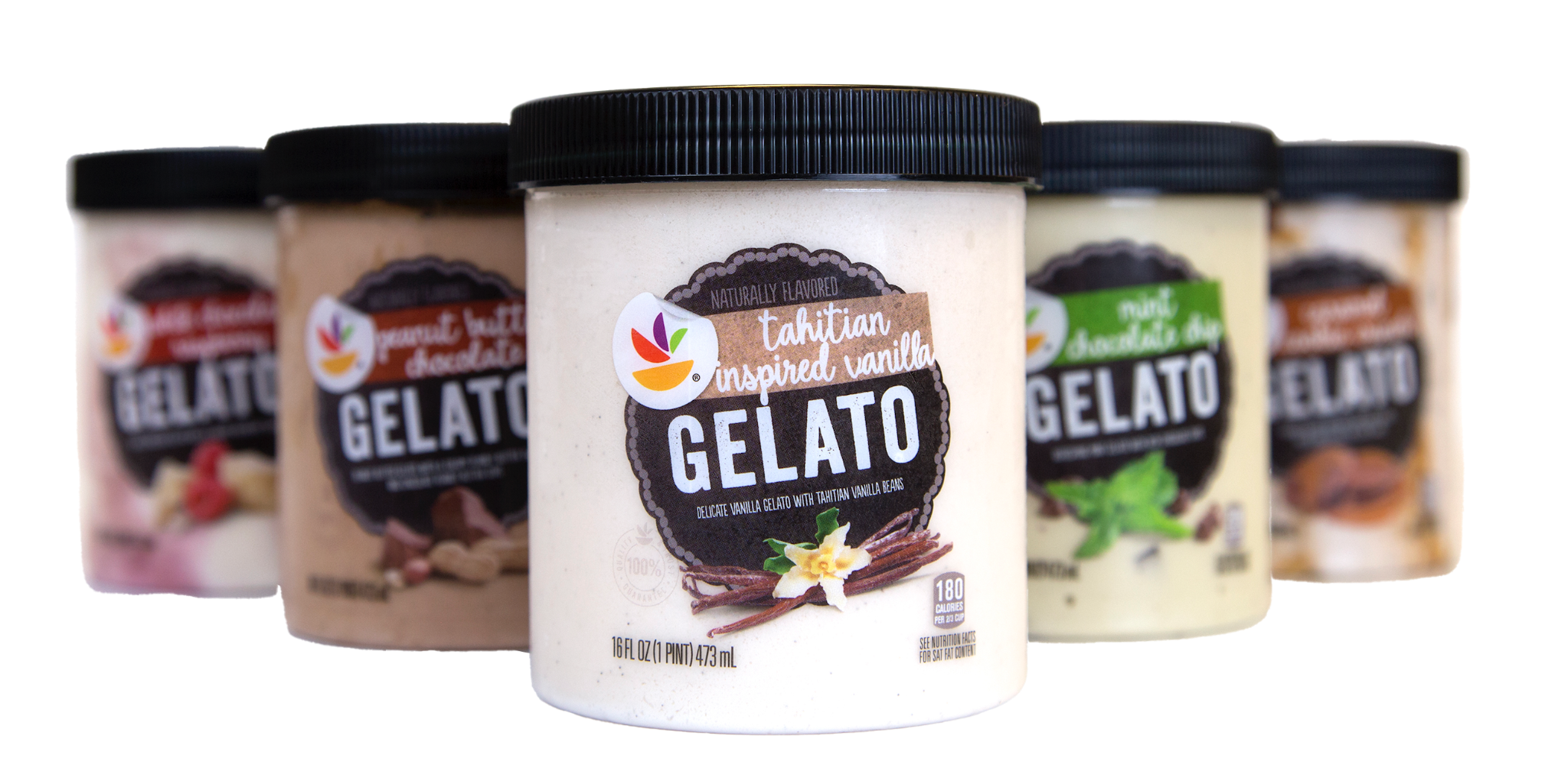
One visual idea. Flavor does the changing.
THE RESULT
PREMIUM
WITHOUT THE FUSS.
the product gets to be the heroNEXT PROJECT
Salad Dressings →