03 / PACKAGING + ART DIRECTION
Swiss
Chocolate.
Making value-tier chocolate feel anything but ordinary.
THE CHALLENGE
Premium quality. Everyday price.
The brief called for a private-brand chocolate bar that could deliver Swiss quality at an accessible price and still feel distinctive in the everyday candy aisle.
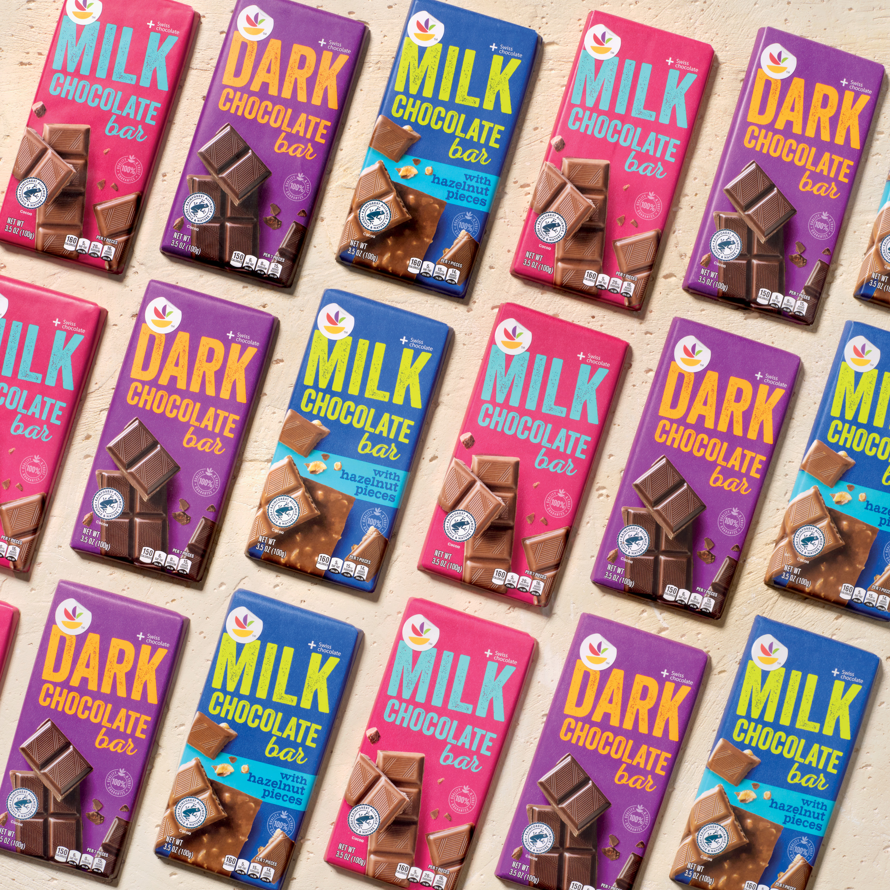
THE THINKING → Value did not need to look quiet. Bold color, confident typography and appetite-driven photography could communicate quality while giving the line serious shelf presence.
THE DESIGN
Turn up the color.
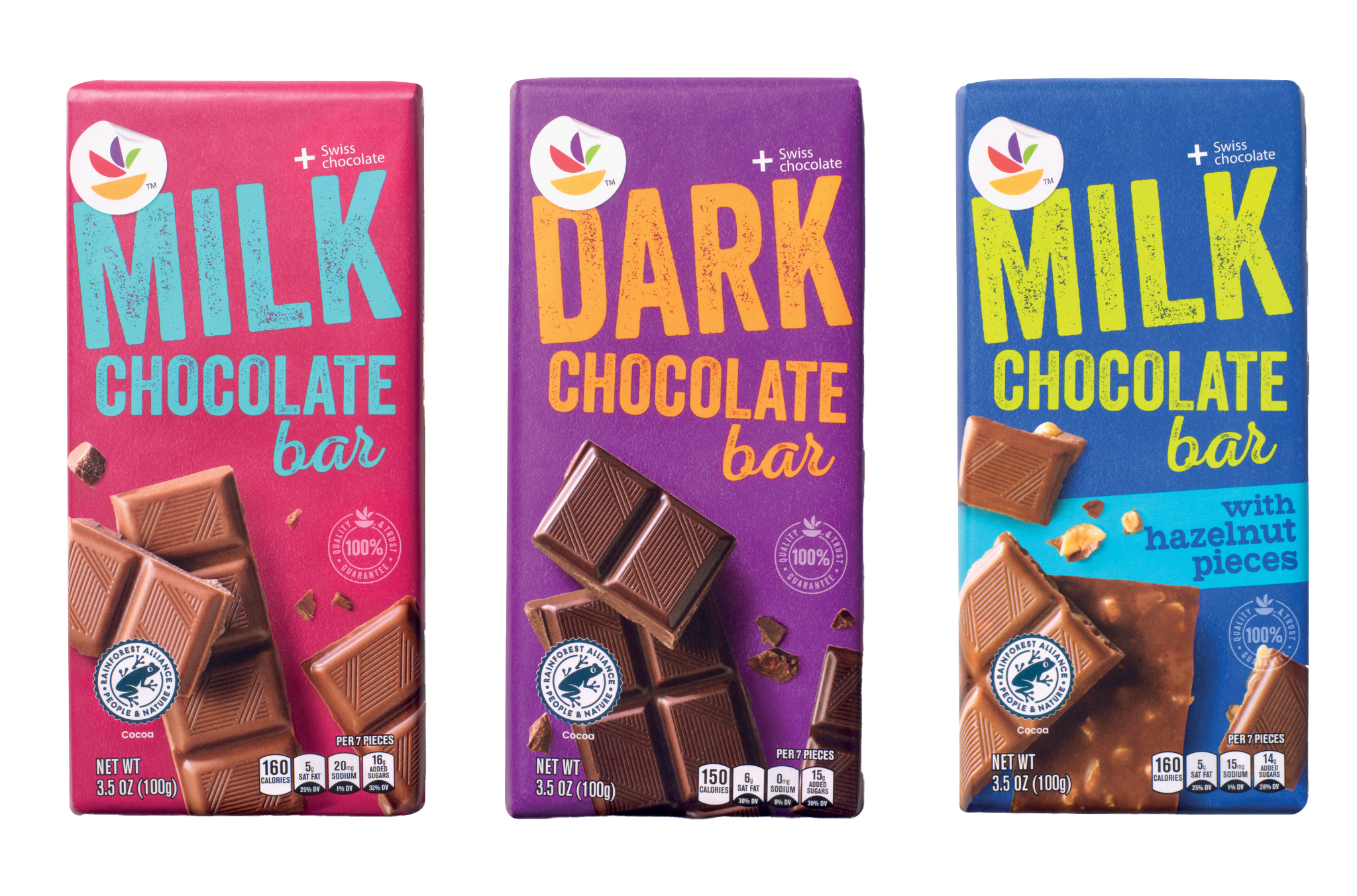
Each flavor received its own saturated color story, while oversized typography created a strong family resemblance. Product photography brings the chocolate forward and makes quality immediately visible.
THE RESULT
Value with some swagger.
The final family feels bright, contemporary and unapologetically visible, while keeping the product itself at the center of the experience.
shelf presence was the point!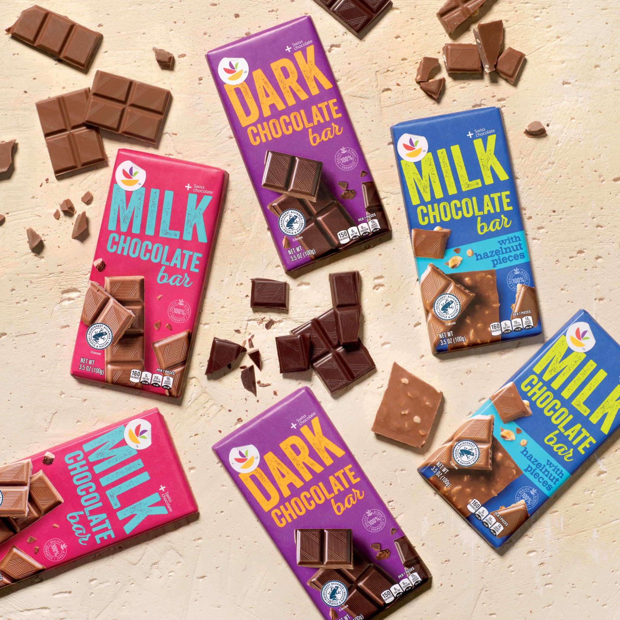
RECOGNITION
SILVER
VERTEX AWARD
sweet. literally.VERTEX AWARD
NEXT PROJECT
CareOne Personal Care →