CareOne
Personal Care.
Taking personal care from clinical to confident.
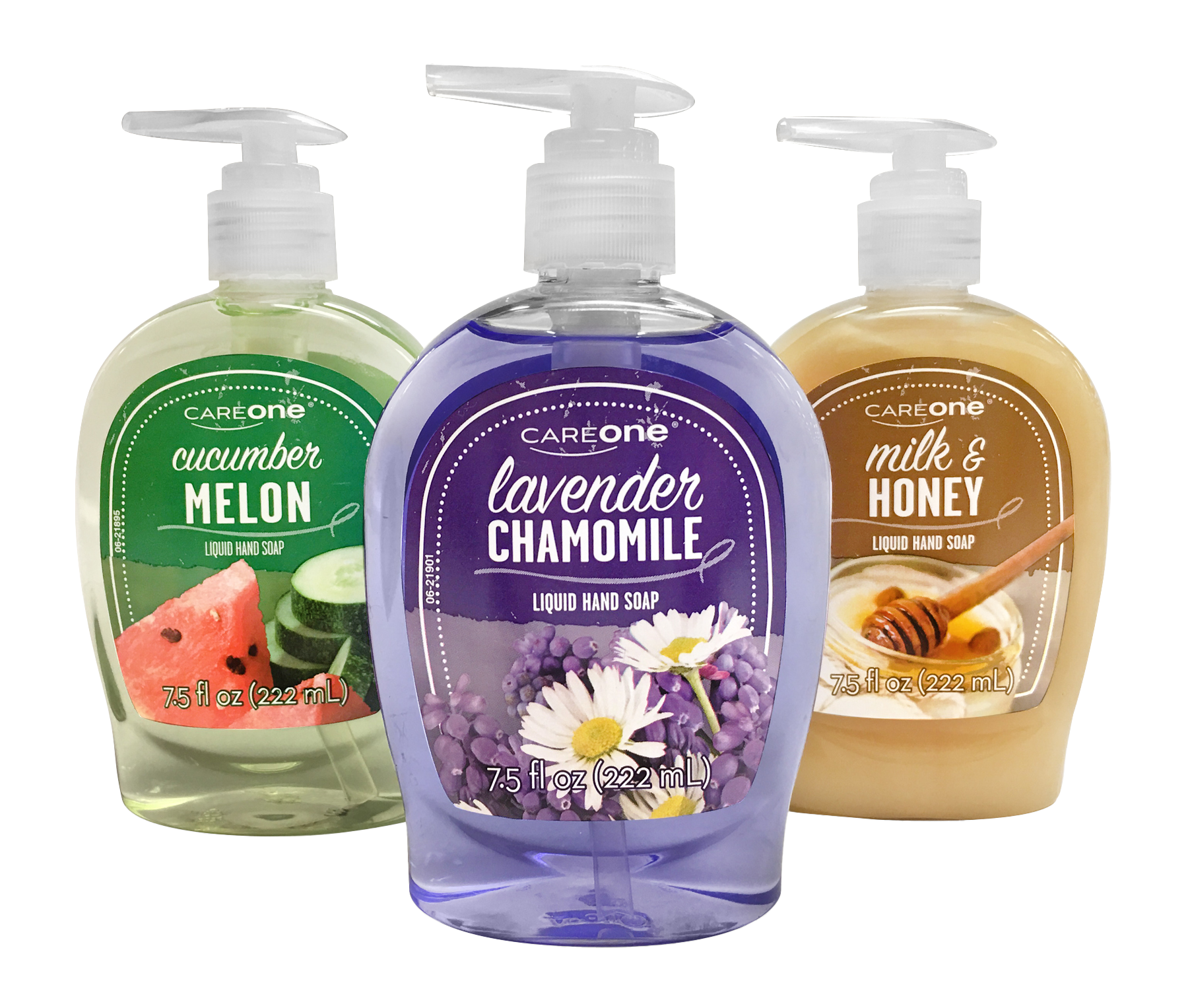
Beauty, not medicine.
CareOne Personal Care needed to break away from the clinical visual language associated with the broader health brand while still remaining unmistakably CareOne.
THE THINKING → Build a flexible visual language that could stretch across personal wash, skincare, hair care, cosmetics and more, while keeping the shopper experience easy and recognizable.
Let scent lead.
Scent is a major decision point in personal care, so fragrance became a prominent part of the design. Vibrant color and a two-font system added personality and helped the products feel more at home on a bathroom counter than in a medicine cabinet.
make what shoppers care about easy to find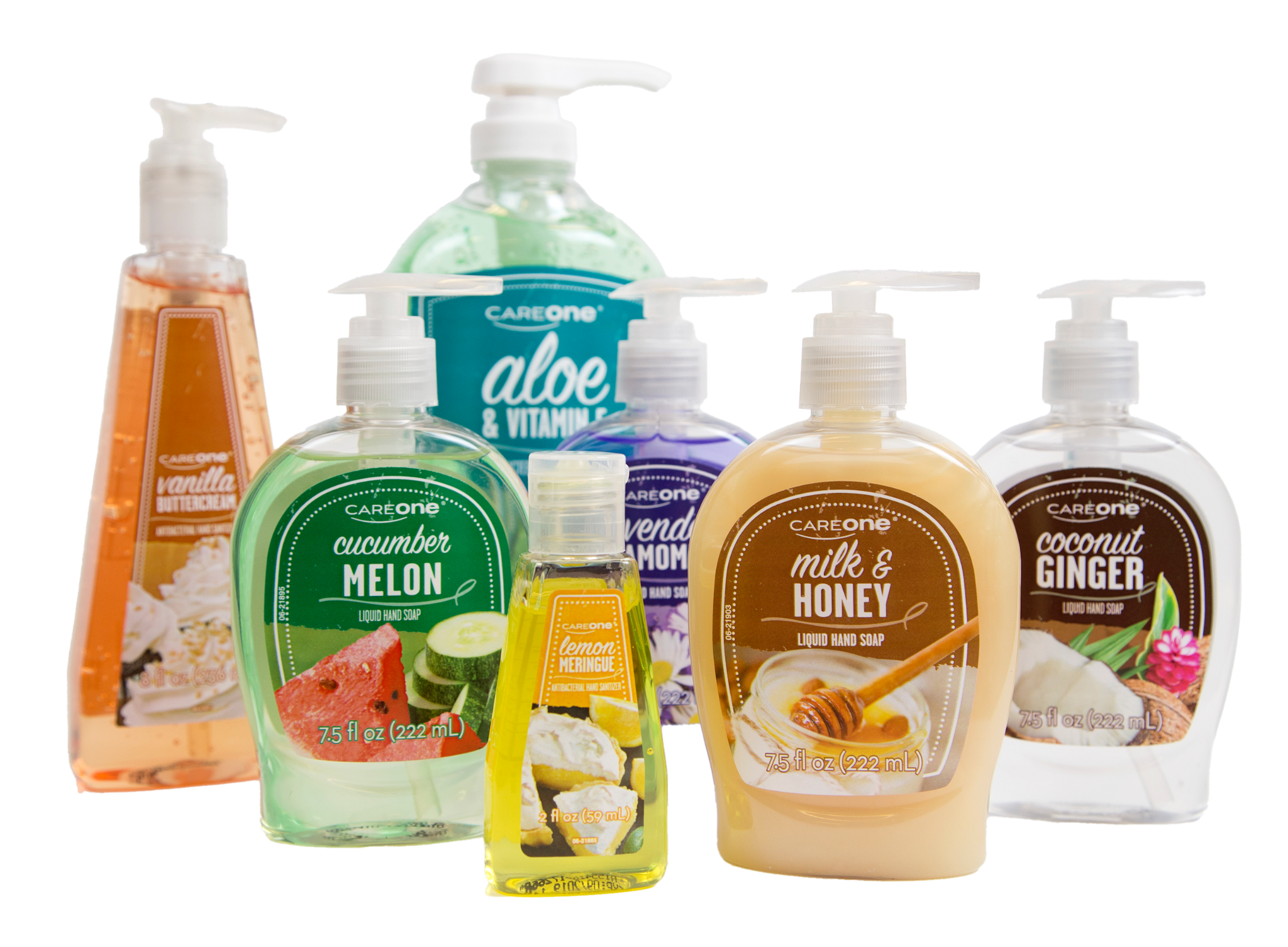
Same personality. A new format.
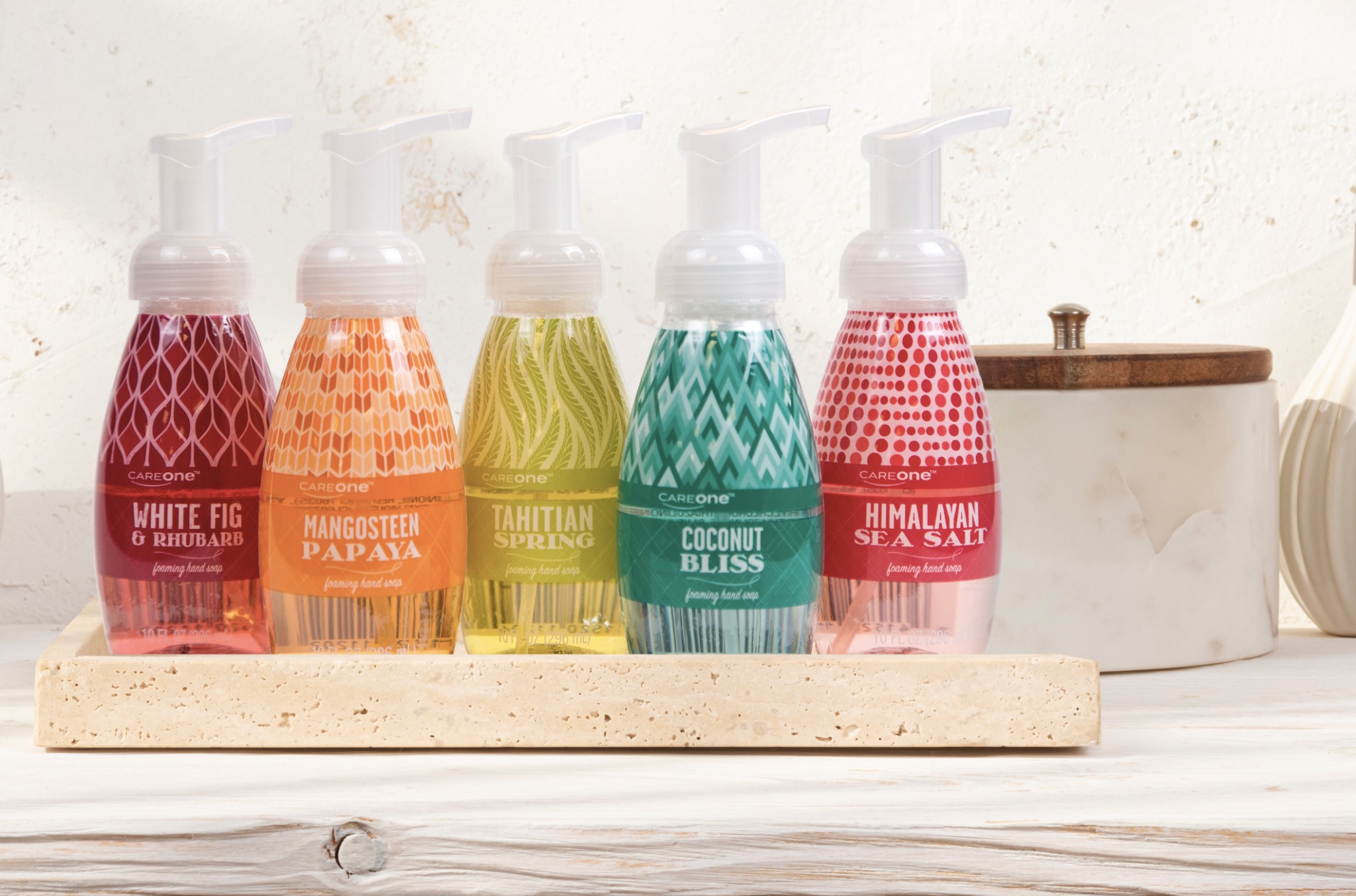
The foaming hand soaps extend the visual language into a different package architecture, using bold pattern and scent-driven color while staying unmistakably CareOne.
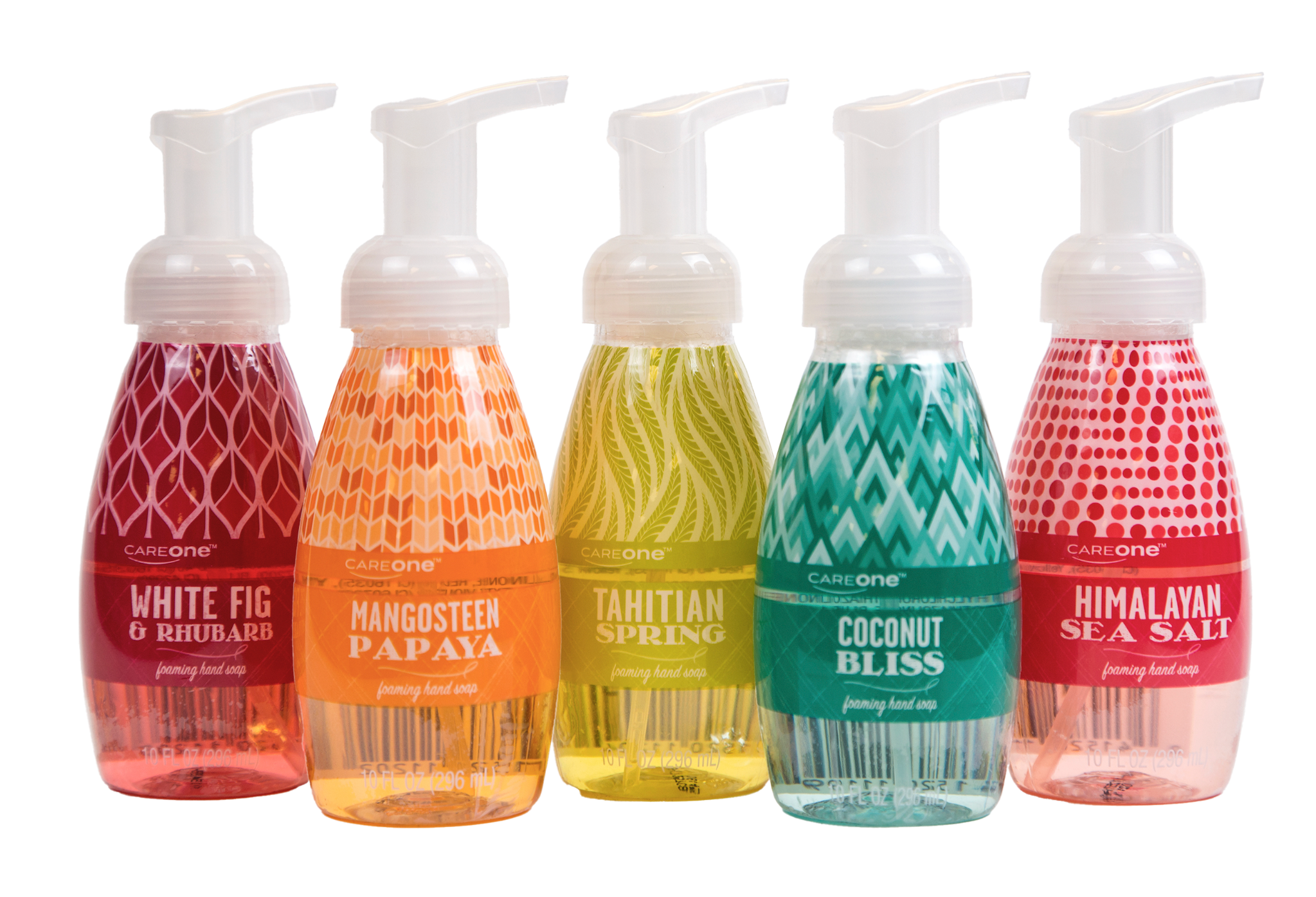
Built to flex.
Consistent typography, holding shapes and brand placement gave the line enough structure to stay cohesive across categories while still leaving room for scent, format and product personality to lead.
Designed to live out in the open.
The environmental photography reinforces the shift away from clinical cues and toward products that feel comfortable in a personal-care space.
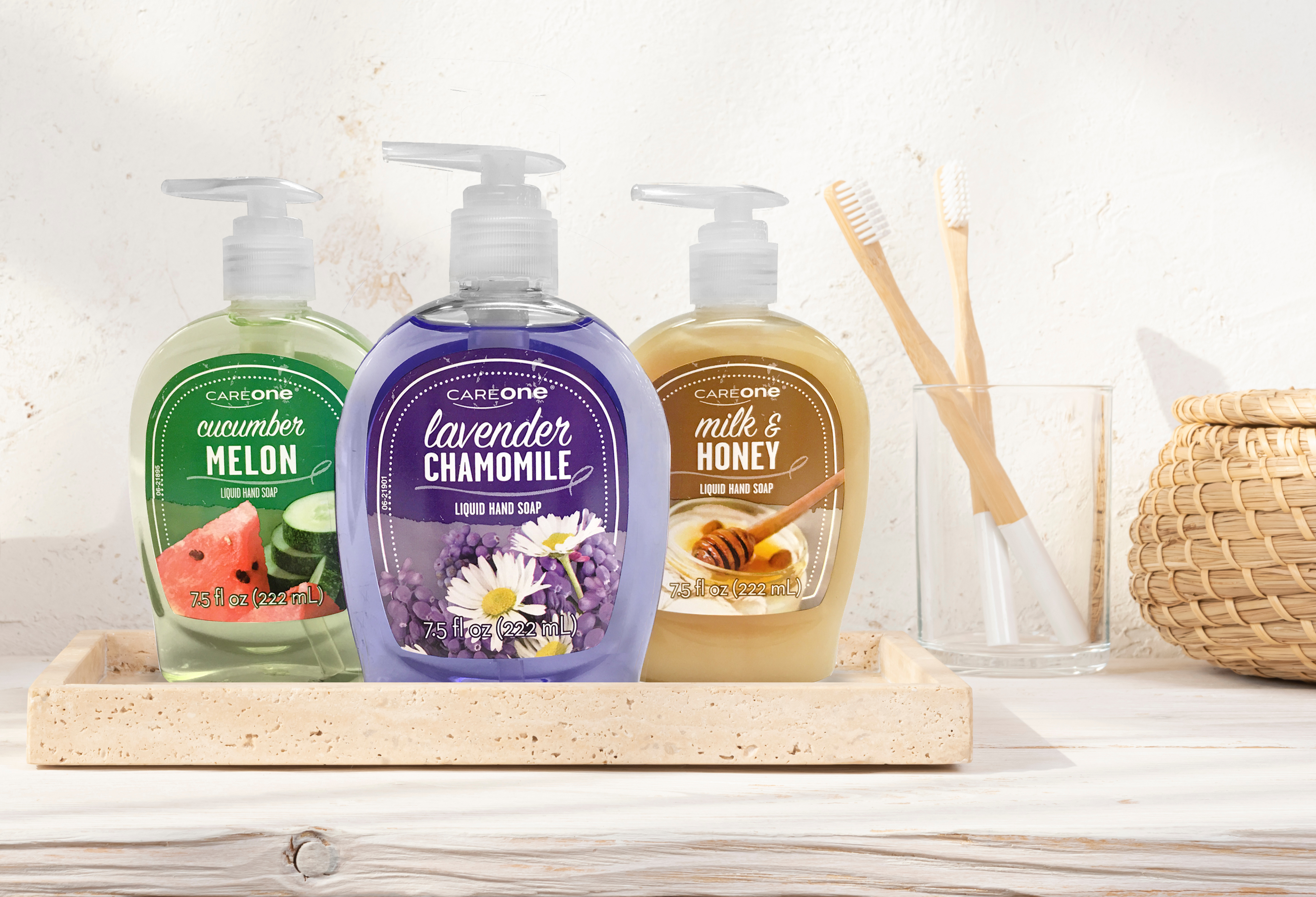
WORTH LEAVING OUT.